
 LightyCollects
- Posts : 30
Join date : 2021-05-30
Age : 53 
 New Logo Ideas
Wed Sep 01, 2021 12:19 pm


Afternoon guys, been playing around with a few ideas for logo.
It is really hard not having a directive to work with so I have thrown three together to get some opinions on them.
Be as honest as you want, it will not offend me in any shape or form.
Admin, Fortune8 and AceBullion like this post

 dingy1688
- Posts : 73
Join date : 2021-08-25
Re: New Logo Ideas
Wed Sep 01, 2021 2:14 pm
my vote goes to the first one
Admin, Fortune8 and AceBullion like this post
 AdminAdmin
- Posts : 3494
Join date : 2021-05-08
Location : England UK
Re: New Logo Ideas
Wed Sep 01, 2021 5:26 pm
I am liking those logos.
The banner is being worked on and I didnt want to share yet but hopefully this will be uploaded soon... as a Temp Banner...
The banner is being worked on and I didnt want to share yet but hopefully this will be uploaded soon... as a Temp Banner...

Fortune8, The Cat's Mother, AceBullion and LightyCollects like this post
 The Cat's MotherModerator
- Posts : 3436
Join date : 2021-05-19
Location : UK
Re: New Logo Ideas
Wed Sep 01, 2021 8:07 pm
I would vote for the first one too. It's a nice clean design, and very clearly relates to the Forum.
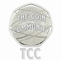
The second is virtually identical to the obverse of the Syrian coinage, so I wouldn't be very keen.
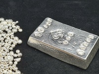
The third shows a jewel, which isn't a precious metal, and the two different typefaces make the design look disjointed. I would still prefer it to the second.
So, in order, my preference is: 1. Stack of bars; 2. The jewel; 3. Syrian eagle.
I think you've done a good job, though, and it is much easier to criticise than do the work in the first place. Thanks.
The second is virtually identical to the obverse of the Syrian coinage, so I wouldn't be very keen.
The third shows a jewel, which isn't a precious metal, and the two different typefaces make the design look disjointed. I would still prefer it to the second.
So, in order, my preference is: 1. Stack of bars; 2. The jewel; 3. Syrian eagle.
I think you've done a good job, though, and it is much easier to criticise than do the work in the first place. Thanks.
Admin, Fortune8, AceBullion and LightyCollects like this post
- The Cat's MotherModerator
- Posts : 3436
Join date : 2021-05-19
Location : UK
Re: New Logo Ideas
Thu Sep 02, 2021 1:16 pm
On further thought, what about an amalgamation of 1 and 2. Using the typeface in the lower half of the jewel, and the picture of the stack of bars, to have something like:
The Precious
[picture of bars]
Metal Forum
Leaving out the acronym TPMF.
I'm sorry I can't do a proper illustration.
It seems to me that this combines the original neat ideas with an end result that would be easier to fit into a letterhead or a confined space, and a single typeface draws it all together. I suggested the lower example because I preferred it, but obviously people will have other preferences and that aspect is not crucial. I do think it's important not have a mix of typefaces in such a small area as a logo though.
Admin and Fortune8 like this post
Permissions in this forum:
You cannot reply to topics in this forum